
Leyser & Silva
Leyser & Silva is a law firm based in Delaware.
My mission was to create the site and branding for the business, which included designing the logo and developing the full website for their media platform.
Methodology
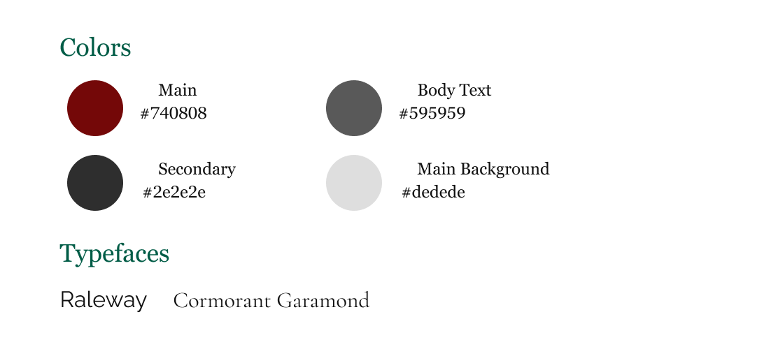
After a discussion with Edward and Edgar, we finalized thecomponents of the site. My research on local competitors inthe area led me to conclude that blue and grey are two verycommon colors. To stand out more, we selected the"burgundy" color. Below are some details.
Put accessibility first. As soon as you enter the site, you willfind all the necessary information to get in contact with us(the firm). Being direct allows clients to access informationas quickly as possible.
The logo
To convey an air of class and seriousness for the business, Icarefully selected the typeface "Cormorant Garamond" andconducted multiple tests until arriving at the final result,which was deemed as "elegant" and well-received.
The concept for the project was to make it as simple aspossible for our regular clients: just scroll and see ourcontacts and services. With this improvement, the firm experienced better communication and engagement withclients, but in special, elders.


